
Canadian players now run most of their casino sessions from a phone. That shift has made interface design a practical issue rather than an aesthetic one. Tap target size, scroll logic, screen layout: these determine whether a session runs smoothly or fights you the whole way through. Knowing what separates a well-built mobile interface from a desktop layout squeezed onto a smaller screen is useful when you’re deciding where to actually play.
If you’re comparing platforms specifically for mobile use, starting with a resource focused on https://rg.org/en-ca/casinos/mobile/apps makes more sense than a general casino review list. Interface quality and technical compatibility get assessed there alongside licensing and payment options, and on a phone those details carry more weight than they do on a desktop.
Why Tap Targets Are a Practical Issue, Not a Cosmetic One
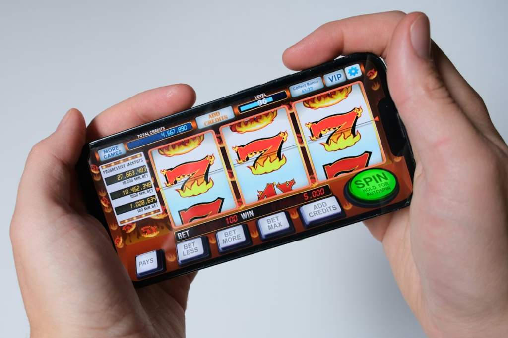
Tap targets are the things you touch to take an action: place a bet, open a menu, confirm a deposit. When they’re too small or crowded together, accidental inputs happen constantly. You try to lower your stake and confirm a higher one instead. You trigger a spin before you’re ready.
Standard UX guidance puts the minimum tap target at roughly 44 by 44 pixels for touchscreen interfaces. Platforms that port their desktop layouts to mobile without adjustment often fall short of this. Buttons get compressed, spacing tightens, and working precisely with a thumb on a five-inch screen becomes genuinely difficult. It sounds minor until you’ve triggered three unintended spins in a row and stopped finding it funny.
Good mobile casino interfaces put the most-used controls, spin buttons, bet adjusters, within natural thumb reach. Less-used elements go into secondary layers. That’s the whole principle, really.
Scroll Logic and How Menus Work on a Small Screen
Game libraries at Canadian casinos can run to several thousand titles. On a widescreen desktop, a grid with multiple rows is manageable. On a phone, that same grid becomes a wall you have to scroll through for a while before finding anything you actually wanted.
Platforms that handle this better tend to do a few consistent things:
- Category filters that stay visible without requiring a scroll back to the top
- A search bar that doesn’t disappear as you move down the page
- A recently played or saved section near the top, so you don’t have to search for games you already know you like
- Lazy loading that keeps page performance stable as you go deeper
Mobile casino sessions in Canada tend to be shorter than desktop sessions and happen more frequently throughout the day. A player spending 30 seconds hunting for a game they already know the name of is a player who may just close the app. The session length math is unforgiving on mobile in a way it isn’t on desktop.
Portrait Mode, Landscape Mode, and Why the Difference Matters
Most people hold their phones upright. Portrait is the default for virtually every other app: messaging, browsing, maps, everything. Casino interfaces designed primarily for landscape ask you to rotate the device and use both hands, which changes the physical nature of the session.
Full-screen portrait games have become more common on Canadian mobile platforms. They use the screen space you already have in a natural grip, with no rotation required. For a short session between other things, that friction reduction is real.
Landscape still has a place. Live dealer tables benefit from the wider aspect ratio because it lets the video feed and betting controls exist on screen simultaneously without overlapping. The issue comes when a platform applies a single orientation logic across every game type without adjusting for these different spatial needs. Slots and live blackjack are not the same use case.
Context-Aware Design and Session Continuity
One thing that separates more developed mobile platforms from basic ones is how they handle ordinary phone interruptions. A call comes in. A notification appears. You switch from Wi-Fi to mobile data on the subway.
On a platform that hasn’t thought about this, a brief interruption drops your session. You come back to the main menu. If a spin or a hand was in progress, it’s either gone or unclear what happened. This is one of the more consistent frustration points in mobile casino UX, and it’s entirely avoidable.
Platforms built with continuity in mind preserve your game state through interruptions. A spin resolves correctly when you return. A live dealer hand doesn’t disappear because your signal dipped for four seconds. None of this is glamorous, but it signals something real about how the platform was built.
Push notifications are part of this too. Alerts about time-limited offers shouldn’t arrive mid-session. When they do, they interrupt the one thing you opened the app to do, which is a reasonable thing to find annoying.
What to Check Before Committing to a Mobile Platform
Interface quality is worth testing before you register. The basics to look at:
- Are in-game controls and deposit screens clearly sized for thumb use?
- Does the game lobby work in portrait mode without requiring two hands?
- If you close the app mid-session and reopen it, does it resume where you were?
- Do live dealer games adjust to landscape without the interface becoming cluttered?
- Do search and filters stay reachable while you scroll through the game library?
These are separate from game selection or bonus terms. A platform that gets this right tends to have applied similar care elsewhere. A platform that got this wrong usually tells you something about the rest of it too.
More Stories
From Classic Slots to Megaways: The Evolution of Online Gaming in Canada
Maximize Your Earnings with an Affiliate Casino Program Today
Unlocking Premium Entertainment: A Deep Dive into QQWIN4D’s Game Library